Monday 21 February 2011

Layers

Lesson 7

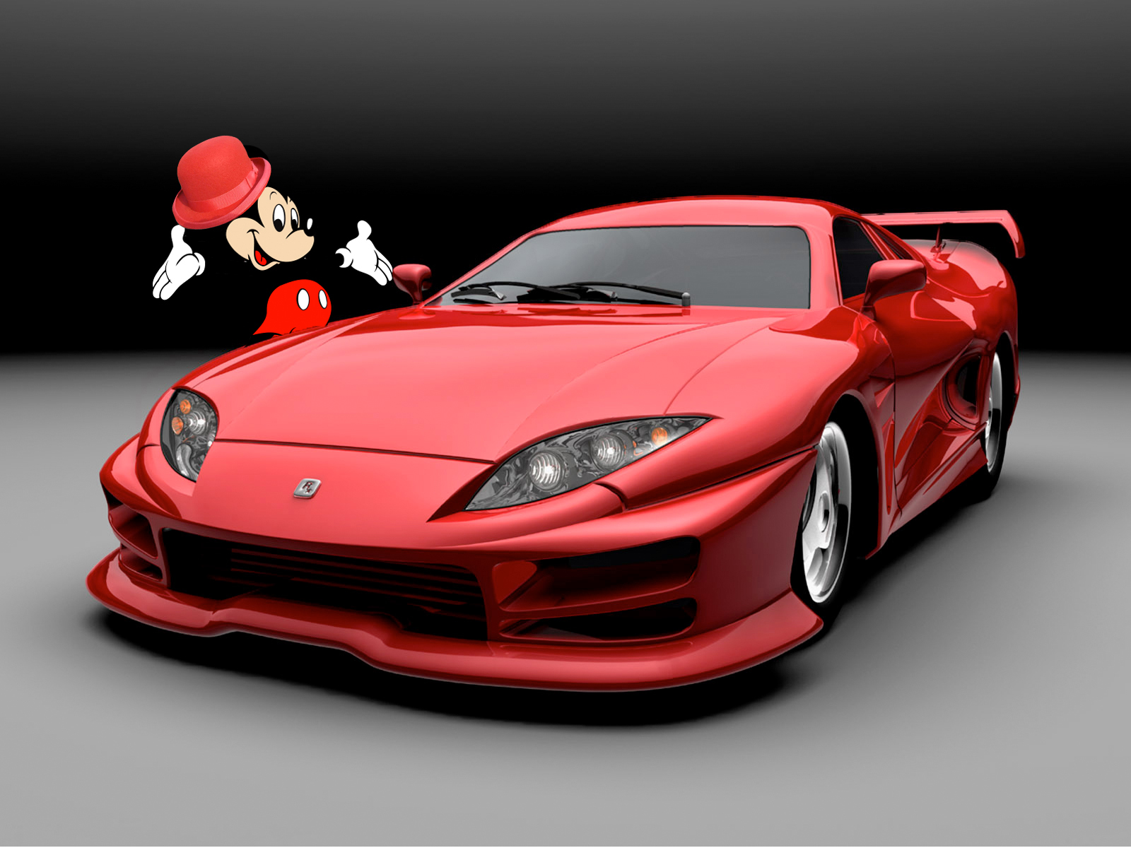
This exercise was designed to introduce us into using layers. For this I created a new layer and copied the content into it. I then cut out the car using the quick-selection tool and positioned it so mickey was behind. I then free-transformed the hat so it fitted Mickey's head. Finally I re-named the layers.


For this exercise I selected each vegetable using the quick selection tool. I then copied and pasted them onto individual layers and arranged them onto the chopping board using the move tool. I then used free transform to enable them to all fit on.


This exercise used many layers, one for each object. For it we altered the look of the image by moving and adding objects and adding layer styles (drop-shadow).


On both of these images I selected the background using the quick selection tool. I then applied a filter to both of them using a smart object layer. On the first image i applied motion blur and one the second a applied poster edges.


On these images I made all the adjustments using adjustment layers. For the first photo I made one layer to convert it to black and white and another to add a tint. On the second photo I made one layer to adjust the levels and an additional one to correct the colour balance.


For this exercise I combined the three different images into one by having 3 separate layers. Then to make it appear that the man was walking on the grass I used a layer mask to cut out an area in the cloud so you can see the man. I lowered the opacity so this was easier to do as you could see the layer below.


On this image I applied a soft gaussian blur to lesson the appearance of wrinkles on this woman's face. I then applied a layer mask to remove the blur from certain areas to keep her eyes, eyebrows, lips and hair sharp.


On this image I applied motion blur. To make it appear that the flying pigeon is blurred due to motion I used a layer mask to remove the blur from everything except from the pigeon in flight.


I applied this tint by adding a new layer of solid purple. I then changed the blend mode to colour and turned down the opacity. This method of applying a tint only applies it to areas of contrast and leaves the white background neutral.


I added contrast to this image by firstly making a new black and white adjustment layer. I then bumped up the red and magenta values. Finally I chose the overlay blend mode.


For this image I used a blend mode to only affect the dark tonal areas. I did this by making a black and white adjustment layer and darkening the cyans and blues and lightening the yellows. I then chose darken colour as the blending mode.


I created this composite picture by copying this texture onto a new layer in the car image. I then chose the lighten blending mode. Finally I used a layer mask to tidy up the image so the texture was just on the car.

Monday 14 February 2011

Adjustments

Lesson 6


I have altered the levels on these 2 photographs to get the correct shadows and highlights. With the top photograph I used the eyedropper tool to select the shadow and highlights which gave the best results. On the second image I determined the shadows and highlights by altering the sliders myself as this worked better.


I have altered the contrast on these 4 images using curves. I have produced 2 copies of both one where the contrast is correct and one where it is extreme.


I corrected the colour cast on this top photo by using colour balance. To remove the cyan tint I added red to the image.


I removed the yellow/green tint to the photo by correcting the colour balance in curves. I selected the shadow, highlight and grey tone in the photo with the eyedropper tool to do this.


I did the same with this photo. I find using curves to remove colour casts is much easier than changing it manually in colour balance.


I removed the red-eye from this image of a dog by selecting the dog's eyes using the lasso tool. I then went on replace colour, selected the red pixels and desaturated and darkened the colour so it was black rather than red. I found this better than using the red-eye tool as it allows you to keep the colour of the yellow iris.


To begin with I used the colour replacement tool to change the colour from red to blue. However I found a much quicker and easier way to do this was by going into replace colour and using the eyedroppers to target the colour and alter it using the hue, saturation and lightness sliders.


To make the result more successful I found that when using the colour replacement tool you need to try and paint it all using one stroke. If a bit gets missed its best to zoom in and use a small brush to correct the colour.


Here I matched the colour of the first photo to the second by using match colour. In this I had to select the source and target image.


I changed the mood of this image by removing most of the colour in it by reducing the saturation.


I converted this image to black and white. I then altered the different tones by clicking on certain tones in the image and dragging to make the tone darker or lighter. This is how I produced this extreme result.


I converted this image to black and white and produced two different results by using the individual colour sliders to change the contrast.


I converted this image to black and white and then applied a green tint to it using the hue and saturation sliders.


First of all I converted this image to black and white and gave it a sepia tint to make it look like an old postcard. I then used one of the filter presets 'cooling filter' to give a different effect.


To get this effect I went to the filter gallery and added various filters to this image. I used fresco, poster edges and watercolour. In this gallery you are able to layer up filters and choose which goes on top of what.


To remove the various scratches on this image I applied the filter, dust and scratches to do this.


To create these 2 different lighting effects I used the lighting effects filter to do this. I used flashlight and orbit.


I used the unsharpen mask to improve this image of an insect and make it more in focus.


As a final exercise on these four images I corrected the contrast and colour balance using curves, altered the sharpness using unsharp mask and matched the colours of the two landscapes and two portraits using match colour using the top image as the source. After this session I feel much more confident on how to adjust images and the best methods to do so.